Pima Indian Diabetes Prediction

This project aims to analyze the medical factors of a patient, such as Glucose Level, Blood Pressure, Skin Thickness, Insulin Level, and many others, to predict whether the patient has diabetes or not.
About the Dataset
This dataset is originally from the National Institute of Diabetes and Digestive and Kidney Diseases. The objective of the dataset is to diagnostically predict whether or not a patient has diabetes based on specific diagnostic measurements included in the dataset. Several constraints were placed on selecting these instances from a larger database. In particular, all patients here are females at least 21 years old of Pima Indian heritage.
The dataset consists of several medical predictor variables and one target variable, Outcome. Predictor variables include the number of pregnancies the patient has had, their BMI, insulin level, age, etc.
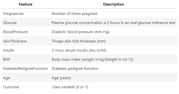
Data Dictionary
Importing the libraries
import pandas as pd
import numpy as np
import matplotlib.pyplot as plt
import seaborn as sns
Loading the dataset
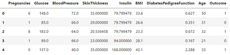
df = pd.read_csv("diabetes.csv")
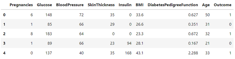
df.head()
Data Preprocessing
Checking the shape of the dataset
df.shape
=> (768, 9)
Unique values in the dataset
variables = ['Pregnancies','Glucose','BloodPressure','SkinThickness','Insulin','BMI','DiabetesPedigreeFunction','Age','Outcome']
for i in variables:
    print(df[i].unique())
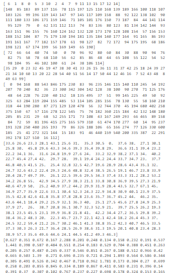
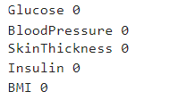
In the dataset, the variables except Pregnancies and Outcome cannot have a value of 0 because it is impossible to have 0 Glucose Levels or 0 Blood Pressure. So, this will be counted as incorrect information.
Checking the count of value 0 in the variables
variables = ['Glucose','BloodPressure','SkinThickness','Insulin','BMI','DiabetesPedigreeFunction','Age',]
for i in variables:
    c = 0
    for x in (df[i]):
        if x == 0:
            c = c + 1
    print(i,c)
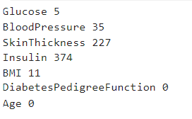
Now that I have a count of incorrect values in the variables, I will be replacing these values.
#replacing the missing values with the mean
variables = ['Glucose','BloodPressure','SkinThickness','Insulin','BMI']
for i in variables:
    df[i].replace(0,df[i].mean(),inplace=True)
#checking to make sure that incorrect values are replace
for i in variables:
    c = 0
    for x in (df[i]):
        if x == 0:
            c = c + 1
    print(i,c)
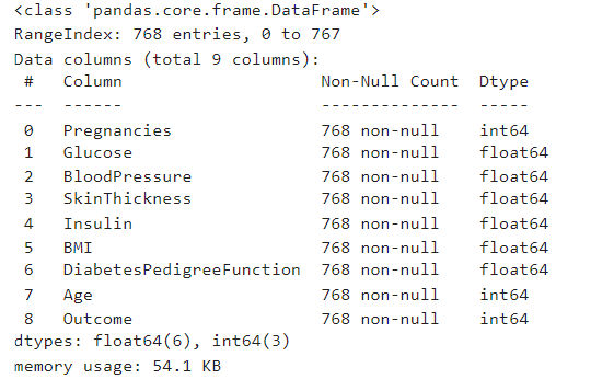
Checking for missing values
df.info()
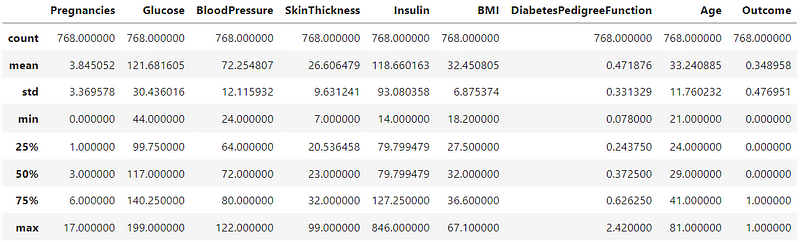
Descriptive Statistics
df.describe()
df.head()
Exploratory Data Analysis
In the exploratory data analysis, I will look at the data distribution, the correlation between the features, and the relationship between the features and the target variable. I will start by looking at the data distribution, followed by the relationship between the target variable and independent variables.
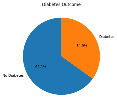
Diabetes Count
plt.figure(figsize=(5,5))
plt.pie(df['Outcome'].value_counts(), labels=['No Diabetes', 'Diabetes'], autopct='%1.1f%%', shadow=False, startangle=90)
plt.title('Diabetes Outcome')
plt.show()
Age Distribution and Diabetes
sns.catplot(x="Outcome", y="Age", kind="swarm", data=df)
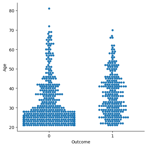
From the graph, it is quite clear that most patients are adults aged 20–30 years. Patients in the age range 40–55 years are more prone to diabetes, as compared to other age groups. Since the number of adults in the age group 20–30 years is greater, the number of patients with diabetes is also more as compared to other age groups.
Pregnancies and Diabetes
fig,ax = plt.subplots(1,2,figsize=(15,5))
sns.boxplot(x='Outcome',y='Pregnancies',data=df,ax=ax[0])
sns.violinplot(x='Outcome',y='Pregnancies',data=df,ax=ax[1])
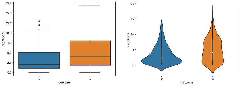
The boxplot and violin plot show a strange relationship between the number of pregnancies and diabetes. According to the graphs, the increased number of pregnancies highlights an increased risk of diabetes.
Glucose and Diabetes
sns.boxplot(x='Outcome', y='Glucose', data=df).set_title('Glucose vs Diabetes')
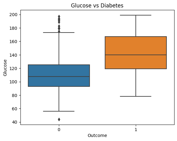
Glucose level plays a significant role in determining whether the patient has diabetes. Patients with a median glucose level of less than 120 are more likely to be nondiabetic. Patients with a median glucose level greater than 140 are more likely to be diabetic. Therefore, high glucose levels are a good indicator of diabetes.
Blood Pressure and Diabetes
fig,ax = plt.subplots(1,2,figsize=(15,5))
sns.boxplot(x='Outcome', y='BloodPressure', data=df, ax=ax[0]).set_title('BloodPressure vs Diabetes')
sns.violinplot(x='Outcome', y='BloodPressure', data=df, ax=ax[1]).set_title('BloodPressure vs Diabetes')
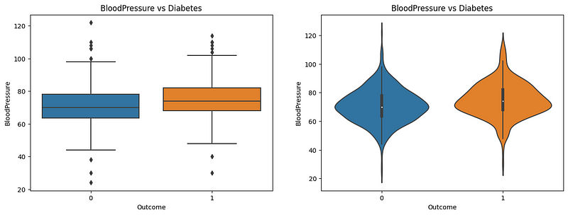
Both the boxplot and violin plot provide a clear understanding of the relationship between blood pressure and diabetes. The boxplot shows that the median blood pressure for diabetic patients is slightly higher than nondiabetic patients. The violin plot shows that the distribution of blood pressure for diabetic patients is slightly higher than for nondiabetic patients. However, there has not been enough evidence to conclude that blood pressure is a good predictor of diabetes.
Skin Thickness and Diabetes
fig,ax = plt.subplots(1,2,figsize=(15,5))
sns.boxplot(x='Outcome', y='SkinThickness', data=df,ax=ax[0]).set_title('SkinThickness vs Diabetes')
sns.violinplot(x='Outcome', y='SkinThickness', data=df,ax=ax[1]).set_title('SkinThickness vs Diabetes')
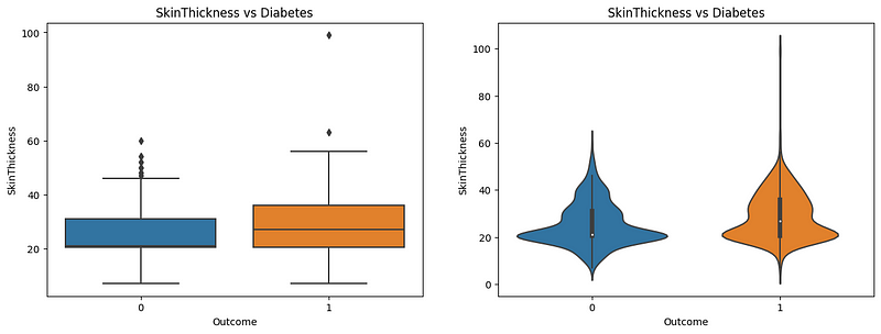
Here, both the boxplot and violinplot reveal the effect of diabetes on skin thickness. As observed in the boxplot, the median skin thickness is higher for diabetic patients than nondiabetic patients. Nondiabetic patients have a median skin thickness of nearly 20, compared to almost 30 in diabetic patients. The violin plot shows the distribution of patients’ skin thickness among the patients, where the nondiabetic ones have a greater distribution near 20, people with diabetes have a smaller distribution near 20, and increased distribution near 30. Therefore, skin thickness can be an indicator of diabetes.
Insulin and Diabetes
fig,ax = plt.subplots(1,2,figsize=(15,5))
sns.boxplot(x='Outcome',y='Insulin',data=df,ax=ax[0]).set_title('Insulin vs Diabetes')
sns.violinplot(x='Outcome',y='Insulin',data=df,ax=ax[1]).set_title('Insulin vs Diabetes')
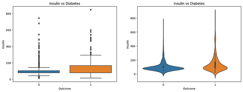
Insulin is a major body hormone that regulates glucose metabolism. It’s required for the body to use sugars, fats, and proteins efficiently. Any change in insulin amount in the body would also result in a change in glucose levels. Here, the boxplot and violinplot show the distribution of insulin levels in patients. In nondiabetic patients, the insulin level is near 100, whereas in diabetic patients, the insulin level is near 200. In the violin plot, we can see that the distribution of insulin levels in nondiabetic patients is more spread out near 100, whereas, in diabetic patients, the distribution is contracted and shows a little spread in higher insulin levels. This indicates that the insulin level is a good indicator of diabetes.
BMI and Diabetes
fig,ax = plt.subplots(1,2,figsize=(15,5))
sns.boxplot(x='Outcome',y='BMI',data=df,ax=ax[0])
sns.violinplot(x='Outcome',y='BMI',data=df,ax=ax[1])
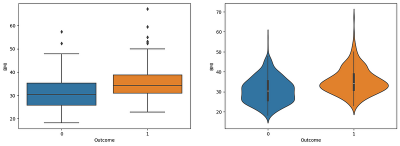
Both graphs highlight the role of BMI in diabetes prediction. Nondiabetic patients have a normal BMI within the range of 25–35, whereas diabetic patients have a BMI greater than 35. The violin plot reveals the BMI distribution, where the nondiabetic patients have an increased spread from 25 to 35, with narrows after 35. However, in diabetic patients, there is an increased spread at 35 and an increased spread at 45–50 compared to nondiabetic patients. Therefore, BMI is a good predictor of diabetes, and obese people are more likely to be diabetic.
Diabetes Pedigree Function and Diabetes Outcome
fig,ax = plt.subplots(1,2,figsize=(15,5))
sns.boxplot(x='Outcome',y='DiabetesPedigreeFunction',data=df,ax=ax[0]).set_title('Diabetes Pedigree Function')
sns.violinplot(x='Outcome',y='DiabetesPedigreeFunction',data=df,ax=ax[1]).set_title('Diabetes Pedigree Function')
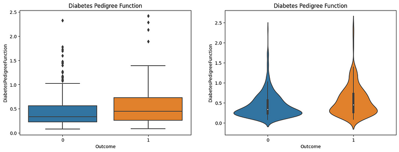
The Diabetes Pedigree Function (DPF) calculates diabetes likelihood depending on the subject’s age and diabetic family history. The boxplot shows that patients with lower DPF are much less likely to have diabetes. The patients with higher DPF are much more likely to have diabetes. In the violin plot, the majority of the nondiabetic patients have a DPF of 0.25–0.35, whereas the diabetic patients have an increased DPF, which is shown by their distribution in the violin plot where there is an increased spread in the DPF from 0.5 -1.5. Therefore, the DPF is a good indicator of diabetes.
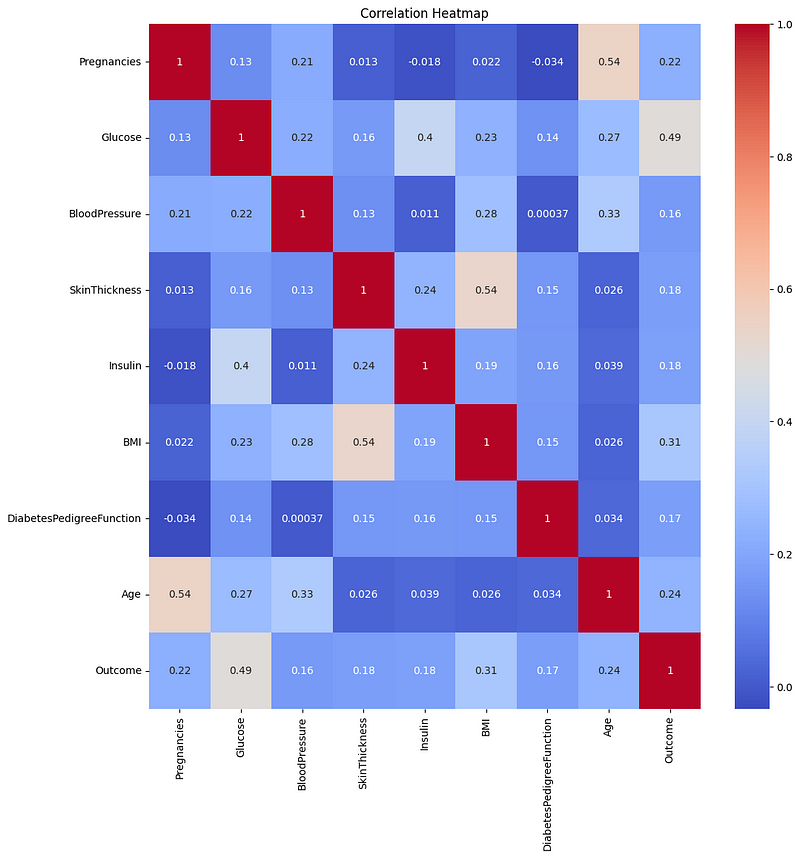
Correlation Matrix Heatmap
#correlation heatmap
plt.figure(figsize=(12,12))
sns.heatmap(df.corr(), annot=True, cmap='coolwarm').set_title('Correlation Heatmap')
Train Test Split
from sklearn.model_selection import train_test_split
X_train, X_test, y_train, y_test = train_test_split(df.drop('Outcome',axis=1),df['Outcome'],test_size=0.2,random_state=42)
Diabetes Prediction
For predicting diabetes, I will be using the following algorithms:
- Logistic Regression
- Random Forest Classifier
- Support Vector Machine
Logistic Regression
#building model
from sklearn.linear_model import LogisticRegression
lr = LogisticRegression()

#training the model
lr.fit(X_train,y_train)

#training accuracy
lr.score(X_train,y_train)
=> 0.7719869706840391

#predicted outcomes
lr_pred = lr.predict(X_test)
Random Forest Classifier
#buidling model
from sklearn.ensemble import RandomForestClassifier
rfc = RandomForestClassifier(n_estimators=100,random_state=42)

#training model
rfc.fit(X_train, y_train)

#training accuracy
rfc.score(X_train, y_train)
=> 0.978543940

#predicted outcomes
rfc_pred = rfc.predict(X_test)
Support Vector Machine (SVM)
#building model
from sklearn.svm import SVC
svm = SVC(kernel='linear', random_state=0)

#training the model
svm.fit(X_train, y_train)

#training the model
svm.score(X_test, y_test)
=> 0.7597402597402597

#predicting outcomes
svm_pred = svm.predict(X_test)
Model Evaluation
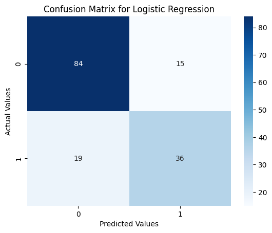
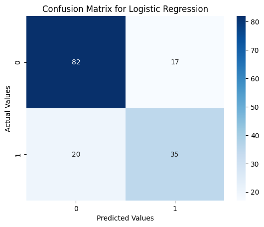
Evaluating the Logistic Regression Model
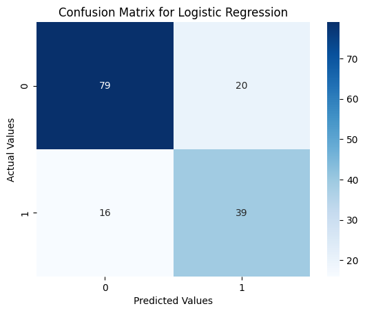
Confusion Matrix Heatmap
from sklearn.metrics import confusion_matrix
sns.heatmap(confusion_matrix(y_test, lr_pred), annot=True, cmap='Blues')
plt.xlabel('Predicted Values')
plt.ylabel('Actual Values')
plt.title('Confusion Matrix for Logistic Regression')
plt.show()
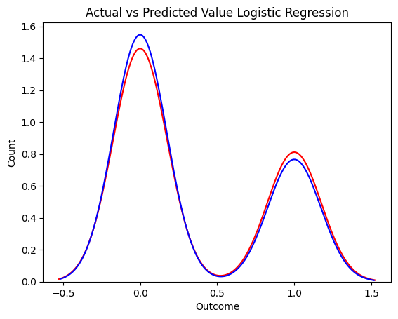
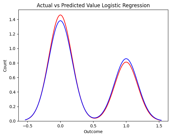
Distribution Plot
ax = sns.distplot(y_test, color='r',  label='Actual Value',hist=False)
sns.distplot(lr_pred, color='b', label='Predicted Value',hist=False,ax=ax)
plt.title('Actual vs Predicted Value Logistic Regression')
plt.xlabel('Outcome')
plt.ylabel('Count')
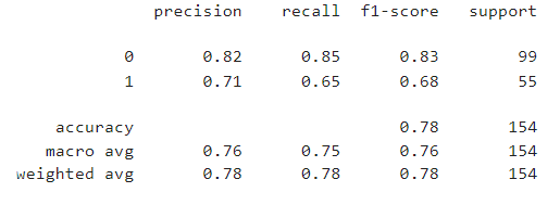
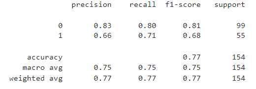
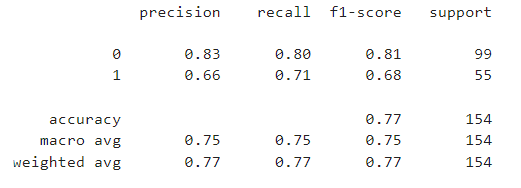
Classification Report
from sklearn.metrics import classification_report
print(classification_report(y_test, lr_pred))
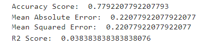
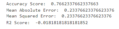
from sklearn.metrics import accuracy_score,mean_absolute_error,mean_squared_error,r2_score
print('Accuracy Score: ',accuracy_score(y_test,lr_pred))
print('Mean Absolute Error: ',mean_absolute_error(y_test,lr_pred))
print('Mean Squared Error: ',mean_squared_error(y_test,lr_pred))
print('R2 Score: ',r2_score(y_test,lr_pred))
Evaluating Random Forest Classifier
Confusion Matrix Heatmap
sns.heatmap(confusion_matrix(y_test, rfc_pred), annot=True, cmap='Blues')
plt.xlabel('Predicted Values')
plt.ylabel('Actual Values')
plt.title('Confusion Matrix for Logistic Regression')
plt.show()
Distribution Plot
ax = sns.distplot(y_test, color='r',  label='Actual Value',hist=False)
sns.distplot(rfc_pred, color='b', label='Predicted Value',hist=False,ax=ax)
plt.title('Actual vs Predicted Value Logistic Regression')
plt.xlabel('Outcome')
plt.ylabel('Count')
Classification Report
print(classification_report(y_test, rfc_pred))
print('Accuracy Score: ',accuracy_score(y_test,rfc_pred))
print('Mean Absolute Error: ',mean_absolute_error(y_test,rfc_pred))
print('Mean Squared Error: ',mean_squared_error(y_test,rfc_pred))
print('R2 Score: ',r2_score(y_test,rfc_pred))
Evaluating SVM Model
Confusion Matrix Heatmap
sns.heatmap(confusion_matrix(y_test, svm_pred), annot=True, cmap='Blues')
plt.xlabel('Predicted Values')
plt.ylabel('Actual Values')
plt.title('Confusion Matrix for Logistic Regression')
plt.show()
Distribution Plot
ax = sns.distplot(y_test, color='r',  label='Actual Value',hist=False)
sns.distplot(svm_pred, color='b', label='Predicted Value',hist=False,ax=ax)
plt.title('Actual vs Predicted Value Logistic Regression')
plt.xlabel('Outcome')
plt.ylabel('Count')

Classification Report
print(classification_report(y_test, rfc_pred))
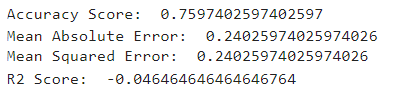
print('Accuracy Score: ',accuracy_score(y_test,svm_pred))
print('Mean Absolute Error: ',mean_absolute_error(y_test,svm_pred))
print('Mean Squared Error: ',mean_squared_error(y_test,svm_pred))
print('R2 Score: ',r2_score(y_test,svm_pred))
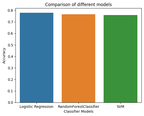
Comparing the Models
#comparing the accuracy of different models
sns.barplot(x=['Logistic Regression', 'RandomForestClassifier', 'SVM'], y=[0.7792207792207793,0.7662337662337663,0.7597402597402597])
plt.xlabel('Classifier Models')
plt.ylabel('Accuracy')
plt.title('Comparison of different models')
Conclusion
From the exploratory data analysis, I have concluded that the risk of diabetes depends upon the following factors:
- Glucose level
- Number of pregnancies
- Skin Thickness
- Insulin level
- BMI
With an increase in Glucose level, insulin level, BMI, and number of pregnancies, the risk of diabetes increases. However, the number of pregnancies has a strange effect on the risk of diabetes, which the data couldn’t explain. The risk of diabetes also increases with an increase in skin thickness.
Coming to the classification models, Logistic Regression outperformed Random Forest and SVM with 78% accuracy. The model’s accuracy can be improved by increasing the size of the dataset. The dataset used for this project was very small and had only 768 rows.
Related Articles