Different Plots Used in Exploratory Data Analysis (EDA)
The importance of EDA in the machine learning world is well known to its users. Making visualizations is one of the finest ways for data scientists to explain data analysis to people outside the business. Exploratory data analysis can help you comprehend your data better, which can aid in future data preprocessing. Additionally, data visualization is essential for streamlining the exploratory data analysis process and facilitating data analysis utilizing beautiful plots and charts.
The EDA, the first chance for visualizations, will be the main topic of this article.
What is EDA?
Exploratory Data Analysis (EDA) is a method for analyzing and summarizing data, frequently using visual tools. EDA is the first step in every machine learning problem solution. It is most likely the crucial component of a machine learning project.
Why is EDA Important?
Given its exponential growth, business organizations seek to utilize data properly so they may use it to inform their strategic decisions. Most datasets are presented as tables; unless you are superhuman, it is impossible to understand data when there are many records, like a million. The data scientist steps in at this point to help us identify the underlying patterns in the graphs and provide answers to our inquiries.
Different Plots Used in EDA
Let’s now explore data and examine various data visualization charts using different data kinds. Additionally, an integrated dataset of Seaborn tips data, which describes the tips each waiter receives from multiple customers, will be used to demonstrate some of the strategies.
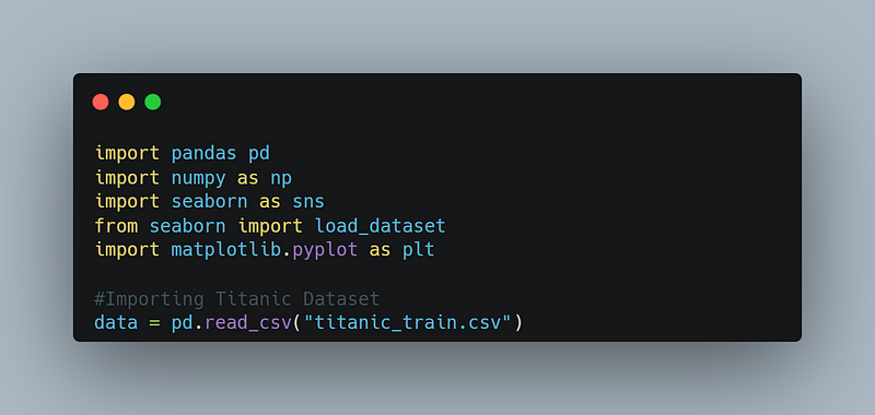
Let’s start by importing all libraries:
Different Analysis Used in EDA
Exploratory Data Analysis typically uses the following techniques:
- Univariate Visualization: It gives information about the fields of raw data.
- Bivariate Visualization: It is used to determine the link between each variable in the dataset and the target variable of interest
- Multivariate Visualization: It is used to comprehend relationships between several fields in the dataset
- Dimensionality Reduction: Although we can visualize in three dimensions, data usually has more dimensions. In these situations, dimension reduction is helpful for visualizations. Ee can compress the dimensions to 2D or 3D using PCA and TSNE.
Univariate Analysis
The simplest type of analysis, known as a univariate analysis, focuses on just one variable and is used to explain the data more accurately. We do the univariate analysis of numerical and categorical variables differently.
Numerical Data
Understanding the distribution of variables allows for more effective data processing, making it crucial to analyze numerical data. Most of the time, you will find that numerical data could be more consistent; therefore, investigate numerical factors.
- Histogram: They are used in univariate analysis and provide an approximate indication of the underlying data distribution’s density or, more precisely, its probability distribution. The histogram plotting depends on “bins,” or dividing the entire range into intervals. The bar height for each bin is then calculated based on the number of values inside that bin’s range.

Output
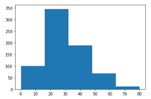
Usage of Histogram: It is generally used when dealing with large datasets and to detect any unusual activities or gaps in the data.
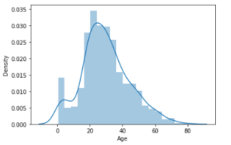
2. Distplot: A distplot is a somewhat improved version of the histogram. It is often known as the “second histogram.” It provides a KDE (Kernel Density Estimation) over the histogram that describes the PDF (Probability Density Function) or the likelihood that each value in this column will occur.
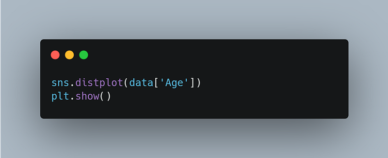
Output
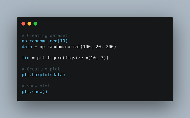
3. Boxplot: An intriguing boxplot plots a five-number summary. We must define some terms to obtain a five-number summary.
- Median
- Percentile — Provides any number representing the total number of values below this percentile.
- Minimum and Maximum — These are the lower and upper limits of the standard deviation, determined using the interquartile range rather than the minimum and maximum values (IQR).
Output
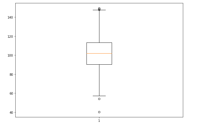
Usage of Boxplot: Boxplots are helpful as they show the average score of a data set. It is beneficial to determine whether a distribution is skewed and whether a dataset contains any potential outliers or odd data values.
Categorical Data
Categorical variables are variables that contain information that can be expressed in text. Let’s examine some charts that can be used to display categorical data.
- CountPlot: A CountPlot is a frequency count plot presented as a bar graph. Each category’s count is plotted as a separate bar. The value counts function in Pandas takes on the exact visual representation when used in any column.

Output:

2. Pie Chart: The pie chart is identical to the CountPlot, but it additionally provides information about the percentage of each category included in the data, which indicates which category is receiving how much weight in the data.
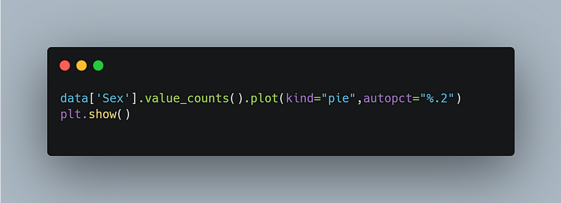
Output
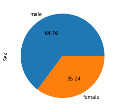
Usage of Pie Chart: Pie charts are usually used to represent categorical data—for example, comparisons in growth areas within a business, such as profit, market expenses, etc.
Multivariate Analysis
When it’s necessary to investigate the link between two distinct variables, we utilize bivariate analysis. In the end, this is what we need to accomplish to develop a robust model. Multivariate analysis is the process of combining more than two variables for analysis.
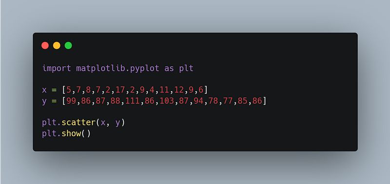
1. Scatter Plot: Graphs that show the relationship between two variables in a data set are called scatter plots. It displays data points either on a Cartesian system or a two-dimensional plane. The X-axis is used to represent the independent variable or attribute, while the Y-axis is used to plot the dependent variable.
Output:
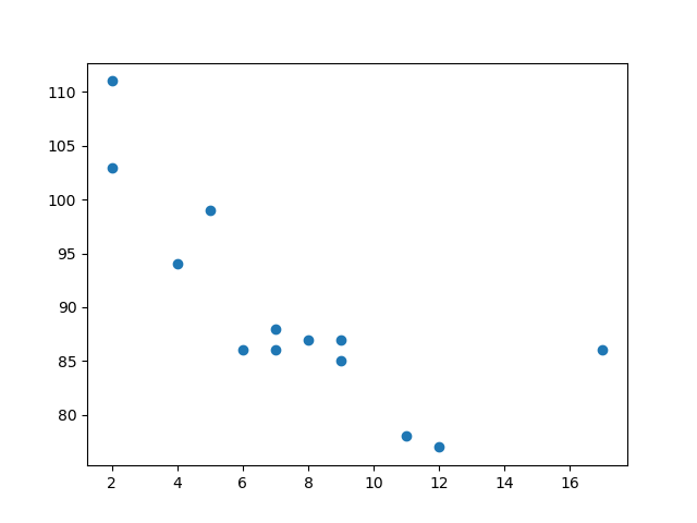
We can also visualize relationships involving three or four variables with a scatter plot.
Usage of Scatter Plot: It is used to analyze individual points, observe and visualize relationships between variables, or get a general overview of variables.
2. Bar Plot: A bar plot is a straightforward diagram that may study the relationship between two variables by plotting a numerical variable on the y-axis and a category variable on the x-axis.
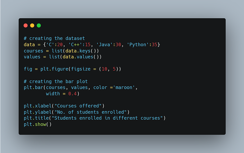
Output:
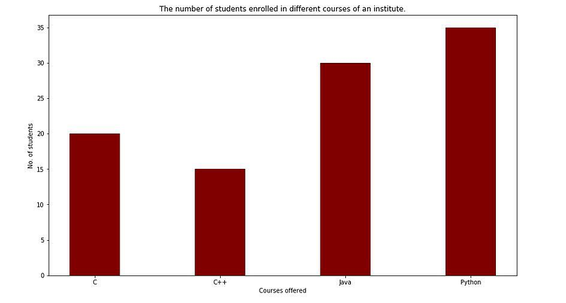
Usage of Bar Plot: It can be used when comparing variables belonging to the same category or observing how one or more variables change over time. For instance, a bar plot is best for comparing a student’s marks across various topics.
EDA is simple to use, which makes it simple for others to grasp our analysis. It is merely a tool to help you better comprehend and describe your data, which enables you to create a robust and more comprehensive model.
Approaching the end of the article, we have learned what EDA is, why it is used, why it is essential, and how to plot different plots using Matplotlib or Seaborn.
If I missed an important detail or you wish to add anything to this blog post, please feel free to ping me. I look forward to hearing your feedback; that’s how we learn 🤗
Related Articles